Welcome to our series of posts about accessibility in communications. Accessibility is the practice of making information, activities, and/or environments sensible, meaningful, and usable for as many people as possible. This is super-important because persons within your audience all have different needs. According to the World Health Organization (WHO), 15 percent of people around the world—that’s over 1 billion—live with a disability. Imagine how many people would never get your message if you didn’t make accessibility a priority!
Accessibility compliance is essential for organizations required to abide by Section 508 and related policies. More importantly, actively pursuing compliance is part of social responsibility and best communications practices. At Avid Core, we are committed to providing equal access and opportunity to people of all abilities and helping our clients and colleagues do the same.
I don’t post on my personal Facebook very often. I like Facebook, but there’s not much there that compels me to alert the 269 characters who make up my “Friends.” But, every once in a while, I see something so critical and so provocative that it must be shared.
Last time this happened, I was still in my 30s, a seasoned graphic designer who thought about color day and night. When I saw that dress—clearly white and gold—being call blue and black by some (including my husband), I knew I had to do something deep and meaningful for my “Friends” and posted the image and question immediately. My post spurred 28 comments, confirming I helped propel “The Dress that Broke the Internet” into our collective consciousness.
I stayed excited about this for way too long. I asked everyone at work, got into arguments with extended family, and presented this internet sensation to my parents, who never look at their Facebook accounts. My mom agreed the dress was white and gold and my dad said the dress was pink and purple—a combo no one else had come up with—when I realized he was guessing.
My dad is a person with color blindness. He sees red and green like this:

He has some mix of protanopia (red-blindness), protanomaly (red-weakness), deuteranopia (green-blindness), and deuteranomaly (green-weakness). Not ideal for Christmas, but he’s never complained.
I was taught in college that tone variation and patterns help viewers distinguish difference and to avoid having similar colors next to each other, so I worked with the aim of not confusing someone like my dad with mistakes like pie charts made entirely of cherry and lime slices.
I looked to Web Content Accessibility Guidelines (WCAG) and other resources for further guidance. Still, the best practices were vague—or at least I had trouble understanding them—until an overhaul in early 2017, when the U.S. Access Board published a final rule for accessibility requirements for information and communication technology (ICT) covered by Section 508. People in my position now had to abide by the updated WCAG Level A Requirements for Use of Color. (Section 508 and WCAG aren’t the same thing, but this Section 508 update harmonized the two accessibility standardization systems.)
The updated WCAG Level A Requirements for Use of Color lay out the requirements for Contrast Ratio, which is enough difference in colors next to each other for most people—even those with color blindness, color insensitivity, and other visual impairments—to distinguish text and objects from the background.
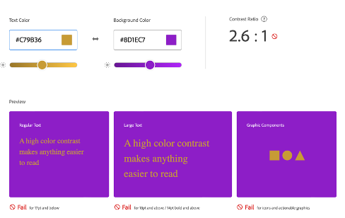
Here’s an example of low or poor Contrast Ratio:
And an example of high or good Contrast Ratio:
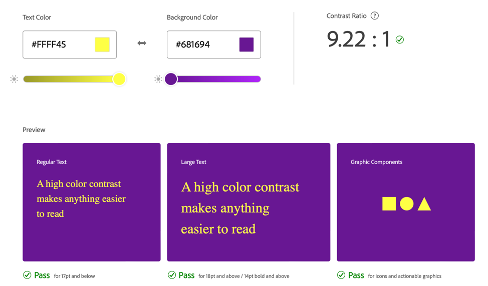
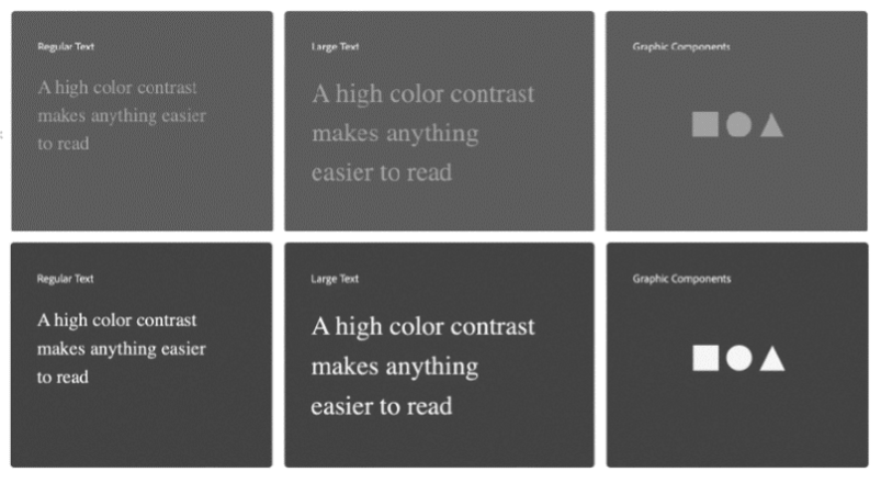
You can see one is clearer than the other, especially if you stand back a bit. The ratio even holds when the image is viewed in black and white.
No one expects you to eyeball this correctly—that’s why a mathematical ratio was established. In fact, even if you’re not a person with color blindness or visual impairment, it doesn’t mean you see color the same way anyone else does. (DO NOT tell my husband who thinks he’s better at seeing color than I am, but I don’t see subtle blues very well. Most people see navy, but I see a handsome dark gray.)
My favorite free Contrast Finder lives here and my favorite free Color Blind Simulator lives here. If you subscribe to Adobe Creative Suite, you can use Adobe Color’s very beautiful and very helpful Accessibility Tools.
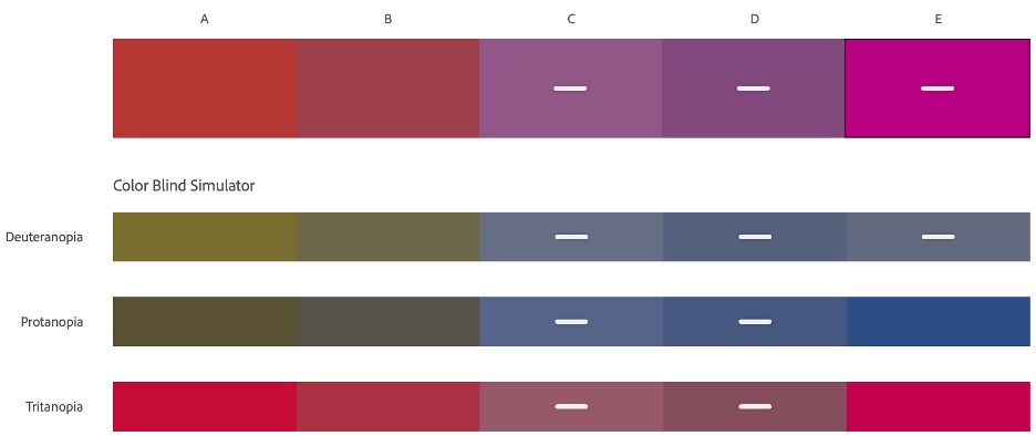
So that brings us back to the dress. Let’s inspect the colors in the dress using Adobe Color:
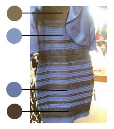
Below are the actual colors. It is interesting to note that what a person with red/green colorblindness sees is pretty close to what the rest of us see. (The top line is what a non-color-blind person would see and the three bottom lines are what persons with the most common types of color blindness would see.)
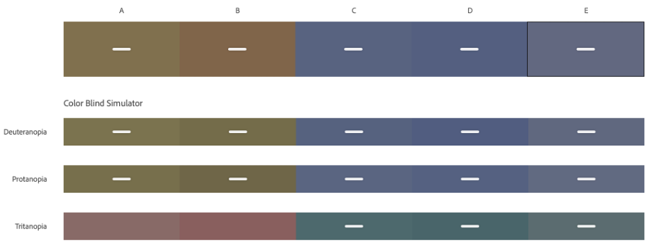
My guess is my dad thought swamp brown and dingy purple couldn’t possibly be the color combo in this dress. For who would buy it?! More likely he gave his best guess that he was looking at reds and purples indistinguishable to him. For example, if he was looking at the top line below, it would appear to him somewhere between the deuteranopia and protanopia lines.
While I’m not excited that this has been a life-long guessing game for my dad and people like him, I am jazzed to have a tool that allows me to see close to what my dad sees. It makes a difference to many of the people viewing what I produce and helps me work to ensure accessibility for all.
Sarah Cox is Avid Core’s Senior Communications Specialist. Connect with her on LinkedIn.