Welcome to our series of posts about accessibility in communications. Accessibility is the practice of making information, activities, and/or environments sensible, meaningful, and usable for as many people as possible. This is super-important as persons within your audience all have different needs. According to the World Health Organization (WHO), over 1 billion people around the world live with a disability. Imagine how many people would never get your message if you didn’t make accessibility a priority!
Accessibility compliance is essential for organizations required to abide by Section 508 and related policies. More importantly, actively pursuing compliance is part of everyone’s social responsibility as well as a communications best practice. At Avid Core, we are committed to providing equal access and opportunity to people of all abilities, while helping our clients and colleagues do the same.
An Alt Text Guide for Intermediate Users
As a spiritual sequel to Accessibility on Screen: 5 Helpful Tips for Writing Effective and Inclusive Alt Text, here are additional tips for successful alternative text composition and usage, as well as a brief exploration of why a deeper understanding of alt text is so crucial in today’s digitally driven world.
Whether you’re running your own hobby blog or are tasked with creating and posting content online as part of your job, taking the time to dive deeper into alt text – its purpose and its varied applicability – can help you learn new ways to utilize this basic, but indispensable, accessibility tool.
Quick Refresher
Alt text is a way to involve all users with your content. Blind or visually impaired people, as well as people with physical or cognitive disabilities, can use screen reader software that reads the displayed content out loud – capturing visual representation, like photos and graphics, with the help of alt text.
While this article is about alt text, it’s important to understand how screen readers work. According to the American Foundation for the Blind, users press “different combinations of keys on the computer keyboard or braille display.” This instructs “the synthesizer to read or spell a word” or to “read a line or full screen of text,” among many other functions.
Users can adjust the reading speed and use keyboard shortcuts to skip around on a given page, making it easier to get a quick sense of what the content is about and maintain their preferred reading pace.
When scrolling through an article online, alt text helps a visually impaired user understand what the image is supposed to represent and why it’s included. (Alt text provides the same service in case an image fails to load.)
Everyone deserves the same user interface considerations, like speedy maneuverability, consistency, and accuracy. Alt text is one of the several ways to ensure this is so.

Above is a photo of Canadian filmmaker David Cronenberg, on the set of one of his productions. Effective alt text for this image would look something like this: “Film director David Cronenberg looks through a handheld viewfinder on set, surrounded by his crew.”
This example does three key things when it comes to good alt text: 1) it highlights the central person or thing within the image, in this case David Cronenberg, 2) it explains the main event or action – i.e., what is taking place or who’s doing what, and 3) it relays the general idea of the image in a concise way.
As underscored in “What Is Alt Text & Why It Matters for SEO” by Kelly Lyons, “screen readers and other assistive technologies usually stop reading alt text at the 125 character mark.” Therefore, it’s best to keep alt text well-contained and to the point.
It’s also a best practice to avoid starting your alt text with “A photo of” or “An image of,” because the screen reader will recognize that section of the page as an image.
(For future reference, here’s a free character counter tool that you can save to your browser’s favorites tab; it provides character and word counts for free, helping to streamline your overall creative process.)
As a general rule, naming well-known places, people, or things is okay to do – such as in the example above. Plus, including a keyword, like David Cronenberg’s name, adds sufficient context and can help boost SEO (Search Engine Optimization). As Lyons underscores, “Google reads alt text to help understand what images are about. Without alt text, your images are much less likely to rank on Google Images.”
Here’s another example:

The alt text for the image above would read: “American filmmaker John Singleton poses in front of a Panavision movie camera.”
Not Just For Pictures
People generally think of alt text as something just for images or photos. This is not so! As explained by TechSmith in their article How to Create Alternative Text for Images for Accessibility and SEO, alt text can (and should) also be used for various diagrams, like charts, tables, and graphs.
TechSmith does point out that “unlike images, most tables are accessible to screen readers. A user is able to move through the table to get the…information if they choose.” In addition to using a caption – which can accurately describe the graph, table, or chart’s data and how it relates to the overall article or story – effective alt text can briefly relay an overview of the diagram, helping a user choose whether or not they want a closer look.
Additionally, since graphs, tables, and charts usually pack a lot of information, it’s important to make the caption work in tandem with the alt text, so that the two components support each other on the page – and not needlessly overlap or copy each other. (Keeping in mind the typical 125 character limit, there’s no way that describing a given graph or table can be accomplished solely through alt text.)
In this case, “your alt text could then just describe the chart’s title and note that a full description of the content is available in the caption” or body copy. Ultimately, the alt text, the caption, and the surrounding text need to “provide all of the relevant information” as a unified whole, so that people using screen readers can understand and navigate a page “in the same way as someone who can see it.”
Below is an example I found in an article posted by Penn State, titled Image ALT Tag Tips for HTML. This example includes a table, a caption for the table, and its accompanying alt text.
As stated in its title, the chart reflects the ten states with the highest number of Pennsylvania German speakers. For the sake of this example, picture that you’re writing a short blog post about these findings. Naturally, you’ll include the chart, a caption (as below), and some alt text for the chart itself.
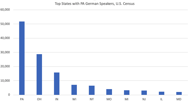
In this case (as provided by Penn State), the alt text reads: “Chart of top 10 states with Pennsylvania German speakers.” The specific states and the number ranges (and where on the table both sets of data are located, the left and bottom or the y and z axes) should be expressed in the surrounding body text.
Putting this information in the caption would also work, but including it in the alt text would definitely exceed the character limit – making it an unnecessary impediment for someone using a screen reader.
Don’t Forget About Decorative Images
Harvard University’s Write good Alt Text to describe images has some great information about decorative images, another kind of visual that people will often find online. Specifically, decorative images are those that “don’t really need further explanation.”
“There’s no need to include alt text for decorative images like icons, horizontal line page breaks, a magnifying glass icon in a search bar,” or anything else along those lines. “Those using screen readers don’t need to know what these images look like to understand the page, and Google doesn’t need further information or additional context in order to rank the webpage.”
Images with Links
TechSmith’s article on alt text also briefly talks about images with links. “All hyperlinks should describe to the user where it will take them.” Links that say “Click Here,” for example, lack the considerations needed for visually impaired people (since “here” doesn’t impart any useful or specific information).
“If you have a button on your page that reads, ‘Download a free trial,’ your alt text should read something like, ‘Link: Download a free trial.’” That way, you’re informing your readers that 1) there is an active link present and 2) where it will take them or what it will do.
Parting Thoughts
Remember, alt text is about making sure everybody gets to understand a given page or article. It’s more than just a facet of one’s accessibility checklist or a way to improve one’s SEO. Alt text is a small but lasting way to foster both accountability and inclusion in today’s fast-paced, digitized world.