According to the Nielsen Norman Group, “sticky headers (or persistent headers) are a common pattern for keeping the header of a website or app in the same place on the screen while the user scrolls down the page…when done appropriately, sticky headers allow users to quickly access the navigation, search, and utility-navigation elements without scrolling up to the top of the page.”
For a long time, sticky headers were seen as a basic tenet of successful user experience (UX), doing away with having to scroll back up to the top of the page to access a website’s menu—providing an overall faster experience.
However, it turns out that this approach does not translate well into the realm of digital accessibility.
Adam Silver, an expert in UX and coding, writes that sticky headers comprise a “fancy pattern that hurts UX far more than it improves it.” Sticky headers “constantly take up space and obscure content” and are especially problematic “on small screens where space is…limited.” For users zooming in on a page, sticky headers can increase in size “to a point where there’s little space for the content.”
Additionally, if a sticky header is “taller than the content and viewport, users will be unable to access the bottom of the menu.”
Sticky headers are “visually accessible” but present a problem for keyboard users who navigate websites using the tab key—the point of focus can eventually disappear behind the sticky header.
So should sticky headers be avoided?
Are there any effective, and accessible, workarounds?
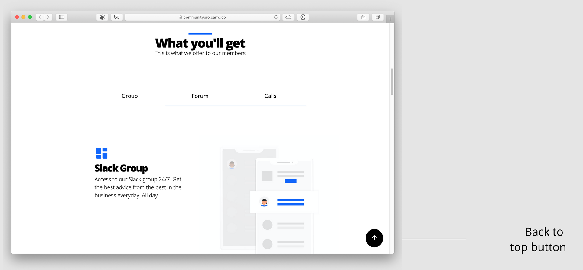
Vitaly Friedman of Smashing Magazine writes that sticky headers can still have their place. They can “aid understanding” by increasing or improving “the discoverability of content,” increasing the speed of interaction. However, it’s important not to include more than “five items in the sticky bar navigation.”
“The choice of the items displayed in the sticky menu should be informed by the most important tasks that users need to perform on the website.” Keeping the sticky header menu sparse helps prevent some of the issues listed above; it also helps keep your website’s organization streamlined and more accessible.
In talking about alternatives to sticky headers, Friedman explains that repeating “relevant calls-to-action or navigation” on a page can help provide a similar level of discoverability. Additionally, a table of contents can be included at the top of a page with a back-to-top link at the bottom or near the bottom of the page.
What about the content that has to be incorporated and organized?
Is there a way of knowing how much is too little or too much?
Paul Andrew of Speckyboy notes that when there’s not a lot of content, “it becomes harder to engage a user.” But, on the other hand, “too much [content] can overwhelm a user, cause a cluttered effect, and be detrimental to the user’s experience.”
One way of getting around this issue is long scrolling. With long scrolling, “content can be spread out, thereby allowing a user to assimilate it at their own pace…without disruptive page-navigation interruptions.”
Long scrolling, used on websites like Tumblr, “is ideal for storytelling, and also for disseminating information that cannot be neatly confined to a conventional web page.”
Vertical and sliding menus
An article published by Pumpkin cites vertical menus as “one of the most effective alternatives” to sticky headers. Using a vertical menu on the left side of the page “leaves 80% of the screen free for content…ensuring that the navigation bar can be accessed from anywhere. A slide out menu can also be a very effective alternative.”
A navigation article on UX Planet explains that sliding menus work especially well with “responsive web design,” like with the Gmail inbox on Android or the “YouTube and Facebook UIs (User Interfaces).”
For creators looking to slim down their website’s presentation, sliding menus can help “de-clutter a mobile screen that has lots of navigation links.” However, there is a caveat.
Penn State’s Accessibility website explains that “users with mobility impairment may find it difficult to move the mouse and click on the correct option” in a sliding menu. “The more options in the menu, the more significant the problem.” Additionally, “if only part of the hierarchy is visible at any one time…users with memory or cognitive disabilities may have difficulty locating a given menu.”
If you don’t do your own coding or know anything about it, don’t worry—depending on your website’s situation, you can talk to your webmaster about establishing an accessible menu. You can also do a quick online search and apply several accessibility techniques at the same time.
Let’s look at some other menu options
“A text-based menu should…be included” on your website and it should be accessible “via a visible link.”
Keep this in mind: Guideline 2.4.5 of the Web Content Accessibility Guidelines (WCAG) states that there has to be “more than one way…to locate a Web page within a set of Web pages.”
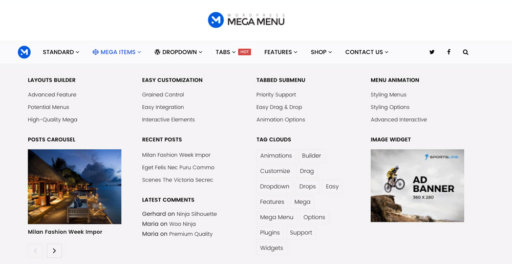
The Nielsen Norman Group has a helpful article that highlights ‘mega menus’—expandable menus that showcase several choices using “a two-dimensional dropdown layout.”
Mega menus are “an excellent design choice for accommodating a large number of options or for revealing lower-level…pages at a glance.”
Whatever menu style you end up using, remember to balance user experience with basic digital accessibility, ensuring that as many users as possible are able to interact with your content.